Coursera has revolutionized online education. Like me it has given hope to millions of students worldwide who want to study different subjects. For fun, I wanted to look at the distribution of languages of the various courses available

I used R and ggplot to create a pie chart
languages = read.csv("Languages.csv",header=TRUE)
library(sqldf)
continents = sqldf("select Continent,sum(Number) Count from languages group by Continent")
library(ggplot2)
ggplot(continents, aes(x="", y=Count, fill=Continent)) + geom_bar(width = 1, stat = "identity") + coord_polar(theta="y") + ylab("Number of Courses")


- Distribution by Region ( excluding English Courses )
I used R and ggplot to create a pie chart
languages = read.csv("Languages.csv",header=TRUE)
library(sqldf)
continents = sqldf("select Continent,sum(Number) Count from languages group by Continent")
library(ggplot2)
ggplot(continents, aes(x="", y=Count, fill=Continent)) + geom_bar(width = 1, stat = "identity") + coord_polar(theta="y") + ylab("Number of Courses")
- Distribution of Asian Courses
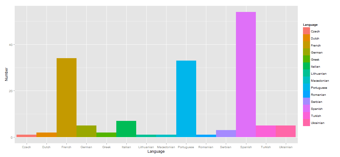
- Distribution of European Courses


