Monday, December 26, 2016

Twiddle Algorithm

Twiddle Algorithm is the simplest of "intelligent" brute force algorithms that are out there. I have written a simple code to demonstrate how the algorithm works and as a sample data set, I have taken financial stock data for the past 5 years


# Implementation of a simple Twiddle Algorithm with Simple stock data

import pandas as pd
import numpy as np
import matplotlib.pyplot as plt
%matplotlib inline


# Let us get the stock prices of around 5 companies which we thing might have some relation to each other
# TATA STEEL
# ONGC
# DLF
# SBI
# MMTC
import pandas as pd
TATA=pd.read_csv('http://real-chart.finance.yahoo.com/table.csv?s=TATASTEEL.NS&d=11&e=26&f=2016&g=d&a=8&b=17&c=2011&ignore=.csv')
ONGC=pd.read_csv('http://real-chart.finance.yahoo.com/table.csv?s=ONGC.NS&d=11&e=26&f=2016&g=d&a=8&b=17&c=2011&ignore=.csv')
DLF=pd.read_csv('http://real-chart.finance.yahoo.com/table.csv?s=DLF.NS&d=11&e=26&f=2016&g=d&a=8&b=17&c=2011&ignore=.csv')
SBI=pd.read_csv('http://real-chart.finance.yahoo.com/table.csv?s=SBIN.NS&d=11&e=26&f=2016&g=d&a=8&b=17&c=2011&ignore=.csv')
MMTC=pd.read_csv('http://real-chart.finance.yahoo.com/table.csv?s=MMTC.NS&d=11&e=26&f=2016&g=d&a=8&b=17&c=2011&ignore=.csv')

# Prepare the data frame
data=pd.DataFrame(data={'tata':TATA['Close'],'ongc':ONGC['Close'],'dlf':DLF['Close'],'sbi':SBI['Close'],'mmtc':MMTC['Close']})

# Convert the data to returns
data=data.apply(lambda x : x/x.shift(1) -1,axis=0)
data=data[1:len(data)]


code. We will now be implementing two functions
1) errorFunction
This will return the sum of squared errorsa
2) twiddle
This is the actual implementation of the twiddle algorithm


# We will now be implementing the Twiddle algorithm
import numpy as np

def errorFunction(data,vectorArray):
    squares=(np.dot(data[['dlf','mmtc','ongc','sbi']],np.array(vectorArray).T) - data['tata'] ) ** 2
    return np.sum(squares)

def twiddle(data,weights,dweights,weightPosDelta,weightNegDelta,debug=False):
    counter=0
    weightHistory=pd.DataFrame(columns=('dlf','mmtc','ongc','sbi'))
    for i in  range(len(weights)):
        bestError=errorFunction(data,weights)
        while(1):
            counter=counter+1
            weightHistory.loc[counter]=weights
            weights[i]=weights[i] + dweights[i]
            error=errorFunction(data,weights)
            if(abs(error - bestError) < 0.0001):
                break
            if(error < bestError):
                bestError=error
                dweights[i]=dweights[i]*(1+weightPosDelta)
            else:
                weights[i]=weights[i] - (2 * dweights[i])
                error=errorFunction(data,weights)
                if(error > bestError):
                    weights[i]=weights[i] + dweights[i]
                    dweights[i]=dweights[i] * (1-weightNegDelta)
                else:
                    bestError=error
            if(debug):
                print("The weights are {} and the error is {} ".format(weights,error))    
        
    # We will plot the individual weights  
    plt.figure(figsize=(20,10))
    plt.plot(weightHistory['dlf'],color='b',label='DLF')
    plt.plot(weightHistory['mmtc'],color='r',label='MMTC')
    plt.plot(weightHistory['ongc'],color='y',label='ONGC')
    plt.plot(weightHistory['sbi'],color='g',label='SBI')
    plt.legend()
    plt.ylabel('Weights of the explanatory variables')
    plt.xlabel('Counter Index')
    plt.title('Variation of weights')
    plt.show()
    # We will plot the final curve
    plt.figure(figsize=(20,10))
    plt.plot(data['tata'],color='b',label='Actual')
    plt.plot(np.dot(data[['dlf','mmtc','ongc','sbi']],np.array(weights).T),color='r',label='Twiddle')
    plt.legend()
    plt.ylabel('Price TATA STEEL')
    plt.xlabel('Date Index')
    plt.title('Actual vs Predicted')
    plt.show()
    return(weights)


When we run the function, we will be getting the following output
1) Plot with the trend of how the individual weights evolve
2) Plot with the predicted(Twiddle) vs actual values
3) The final weights 


dweights=[1,1,1,1]
twiddle_weights=twiddle(data,weights,dweights,0.1,0.1)
print(twiddle_weights)


We can see the way, the weights are recalculated. It is not a very robust algorithm, but it can be tweaked to your convenience

Play with it. A notebook is available in my github post
https://github.com/anantguptadbl/utilities/blob/master/Twiddle%20Algorithm.ipynb

Thursday, June 16, 2016

Sparse and Dense Arrays/Matrices in Python

We must have heard about sparse and dense matrices in Python. I tried to analyse the space usage between these two

The code is as follows


import getsizeof
import numpy as np
import scipy.sparse as sps
import sys

def createGeometric(start,ratio,lengthofSequence):
 i=0
 while i < lengthofSequence:
  yield(start * pow(ratio,i))
  i=i+1

numpySizeList=[]
scipySizeList=[]
lengthList=[]
for value in createGeometric(1,3,10):
 a=np.random.rand(value)
 b=sps.csr_matrix(np.random.rand(value))
 numpySizeList.append(sys.getsizeof(a))
 scipySizeList.append(sys.getsizeof(b))
 lengthList.append(value)

import matplotlib.pyplot as plt
import math
plt.figure()
numpySizeList=map(lambda x:math.log(x),numpySizeList)
scipySizeList=map(lambda x:math.log(x),scipySizeList)
lengthList=map(lambda x:math.log(x),lengthList)
plt.plot(numpySizeList)
plt.plot(scipySizeList)
plt.plot(lengthList)  
        
I plotted the space usage


RED : Length of Array
GREEN : Log of Size of Sparse Array
BLUE : Log of Size of  Dense Array

The difference is just immense. I am trying to understand how the underlying data structure works for these matrices


Monday, September 28, 2015

Implied Volatility in R ( Newton Raphson )

Just how fast is Newton Raphson method. We will not be able to understand the power unless we compare it with other methods
I am trying to find the Implied Volatility of an option using 2 methods

1) BISECTION METHOD

This involves providing a limit for the variable in question and adjusting the lower and higher limit based on the output of the current iteration

We have an ordinary Black Scholes equation
BS = function(S, K, T, r, sig, type="C"){
  d1 = (log(S/K) + (r + sig^2/2)*T) / (sig*sqrt(T))
  d2 = d1 - sig*sqrt(T)
  if(type=="C"){
    value = S*pnorm(d1) - K*exp(-r*T)*pnorm(d2)
  }
  if(type=="P"){
    value = K*exp(-r*T)*pnorm(-d2) - S*pnorm(-d1)
  }
  return(value)
}

The Bisection method will try to reduce the err term in the code below
err  = BS(S,K,T,r,sig,type) - market

The function implied.vol will take these inputs and minimise the err term upto 1000 iterations
implied.vol =
  function(S, K, T, r, market, type){
    sig = 0.20
    sig.up = 1
    sig.down = 0.001
    count = 0
    err = BS(S, K, T, r, sig, type) - market 
    
    ## repeat until error is sufficiently small or counter hits 1000
    while(abs(err) > 0.00001 && count<1000 div="">
      if(err < 0){
        sig.down = sig
        sig = (sig.up + sig)/2
      }else{
        sig.up = sig
        sig = (sig.down + sig)/2
      }
      err = BS(S, K, T, r, sig, type) - market
      count = count + 1
    }
    print(c("Counter is ",count),sep='')
    ## return NA if counter hit 1000
    if(count==1000){
      return(NA)
    }else{
      return(sig)
    }
  }

I clocked the execution and took the following AAPL option
Oct 2 Expiry as on 28th September with a Strike Price of 110

startTime = Sys.time()
implied.vol(112.44,110.00,4/252,.0031,3.50,"C")
print(Sys.time() - startTime)

0.02500105 secs 17 iterations

2) NEWTON RAPHSON

Newton-Raphson method (univariate)


We will recalculate the option price using Newton Raphson

NR = function(f,tolerance=.0000001,start=1,iteration=100)
{
  deltax=.0000001
  counter=1
  current=start
  arrayofSolutions=numeric(iteration)
  while(counter <=iteration)
  {
    df.dx=(f(start+deltax) -f(start))/deltax
    current=start - (f(start)/df.dx)
    #print(current)
    arrayofSolutions[counter]=current
    counter = counter + 1
    if(abs(current-start) < tolerance) break
    start=current
  }
  return(arrayofSolutions[1:counter-1])
}

BSVolatility = function(volatility)
{
  BS(112.44,110.00,4/252,.0031,volatility,"C") - 3.5
}

I clocked the timings
startTime = Sys.time()
NR(BSVolatility,.000001,1,100)
print(Sys.time() - startTime)

0.01400089 sec 4 iterations

Sunday, September 27, 2015

Bollinger Bands using R

Bollinger Plots are a very good way of providing technical information on plausible Buy or Sell on a particular security. They are based on moving averages and thus are simple to create

However, there are 2 parameters that are inputs to the Bollinger Band
1) The period of days considered for calculating the moving average
Most of the analysts use a 20 day plot, but you can use any period based on the security. e.g. A highly liquid security with high volatility should have a lower period.

The R script can be downloaded here

# Bollinger Bands
Ticker = 'AAPL'
URL = paste(c('http://real-chart.finance.yahoo.com/table.csv?s=',Ticker,'&a=01&b=01&c=2015&d=04&e=10&f=2015&g=d&ignore=.csv'),collapse="")
Prices = read.csv(URL)
Prices = Prices[,c(1,5)]
# Simple moving average of a vector of price and the number of days
getMovingAverage = function(dataVector,periodDays,method){
  dataVectorOutput = dataVector
  lengthofVector = length(dataVector)
  for(start in 1:lengthofVector)
  {
    if(start < periodDays)
    {
      dataVectorOutput[start] = NA
    }
    else
    {
      if(method=="mean")  dataVectorOutput[start] = mean(dataVector[start-periodDays:start])
      else if(method=="sd") dataVectorOutput[start] = sd(dataVector[start-periodDays:start])
    }  
  }
  return(dataVectorOutput)
}

dataVectorOutputMean = getMovingAverage(Prices$Close,20,"mean")
dataVectorOutputSD = getMovingAverage(Prices$Close,20,"sd")
Prices$Middle = dataVectorOutputMean
Prices$Upper = dataVectorOutputMean + dataVectorOutputSD * 2
Prices$Lower = dataVectorOutputMean - dataVectorOutputSD * 2

#Remove all the NULLS
Prices = Prices[!is.na(Prices$Middle),]

# Change the date to something that ggplot will understand
Prices$Date = as.POSIXct(as.character(Prices$Date),"%Y-%m-%d")

# Plot the Bollinger
library(ggplot2)
g = ggplot(Prices,aes(Date,Close,group=1)) + geom_line()
g = g + geom_line(data=Prices,aes(Date,Upper,group="Upper Bollinger",color="Upper Bollinger"),size=1)
g = g + geom_line(data=Prices,aes(Date,Middle,group="Middle Bollinger",color="Middle Bollinger"),size=1)
g = g + geom_line(data=Prices,aes(Date,Lower,group="Lower Bollinger",color="Lower Bollinger"),size=1)
g = g + xlab("Date") + ylab("Prices")
g


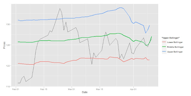
A Sample plot for the AAPL Stock was created using the above script

Sunday, September 20, 2015

Curve Fitting

It is wonderful to see how so many things that we learn individually in our mathematics class come together to solve one problem statement

Lets say we have the density of returns of a particular stock. I want to know the mathematical formula that would simulate the graph

In the graph shown above, we have the returns for  AAPL. Now I tried using the Generalized Hyperbolic distribution and fitted it using Maximum Likelihood Estimation. It has done a pretty good job but we want to be more accurate. We will see what else we can do to make it more accurate

Thursday, April 30, 2015

Relation between 2 distributions

Often we must have faced a situation where we wanted to know, how similar is a distribution compared to the other one. Okay, you got me, correlation is an answer, but what if I want to know how similar and far away are the distributions from each other

In my earlier blog post, I was adopting a crude manner. It worked because I needed a rough figure, but if you want statistically backed numbers, there are a lot of methodologies out there

http://en.wikipedia.org/wiki/Bhattacharyya_distance
http://en.wikipedia.org/wiki/Mahalanobis_distance
http://en.wikipedia.org/wiki/Kullback%E2%80%93Leibler_divergence

We will now compare the results for each of the above methods for various series

  • series1 = c(1,2,3,4,5)
    series2 = c(1,2,3,4,5)
Bhattacharya Distance : 0
Mahalanobis Distance : 0
Kullback Liebler Divergence : 0

  • series1 = c(1,2,3,4,5)
    series2 = c(1,2,3,4,10)
Bhattacharya Distance : 0.182661
Mahalanobis Distance : 0.03571429
Kullback Liebler Divergence : 0.444719


  • series1 = c(1,2,3,4,5)
    series2 = c(1,2,3,4,20)
Bhattacharya Distance : 0.7277557
Mahalanobis Distance : 0.25
Kullback Liebler Divergence : 1.201438
  • series1 = c(1,2,3,4,5)
    series2 = c(1,2,3,4,50)
Bhattacharya Distance : 2.305805
Mahalanobis Distance : 1.35
Kullback Liebler Divergence : 2.191514

From the above results we can see that Bhattacharya Distance and Kullback Liebler Divergence is a better measure of the divergence of two series. Their movement does not change very rapidly with one outlier


If we now get on to serious business, comparing stock prices. The stocks that I have chosen are
1) Apple : AAPL
2) Amazon : AMZN

I have considered 2 months of daily trading data


Bhattacharya Distance : 31.17678
Mahalanobis Distance : 31.10953
Kullback Liebler Divergence : 2416.31

Let us take another example with a lot of volatility


Bhattacharya Distance : 6.910062
Mahalanobis Distance : 6.415947
Kullback Liebler Divergence :42.18934

We see that almost all the values have decreased. This is because the two stock prices are closer to each other. WE need to find a way in which we can use the distance values and plug it into the correlation analysis

The code for the various distances is mentioned below

series1 = c(1,2,3,4,5)
series2 = c(1,2,3,4,50)
cov1 = cov(as.matrix(series1))
cov2 = cov(as.matrix(series2))
mean1 = mean(series1)
mean2 = mean(series2)
meanAverage = (mean1+mean2)/2
seriescov = (cov1+cov2) / 2
bhatt = (1/8) * t(as.matrix(mean1-mean2)) %*% solve(as.matrix(meanAverage)) %*% as.matrix(mean1-mean2) + 0.5*log(seriescov/sqrt(cov1*cov2))
mahal = (1/8)*t(as.matrix(mean1-mean2)) %*% solve(as.matrix(meanAverage)) %*% as.matrix(mean1-mean2)
kullback = 0.5 * ( ( matrix.trace(solve(as.matrix(cov2))%*%as.matrix(cov1)) ) + (t(mean2 -mean1) %*% solve(cov2) %*% as.matrix(mean2-mean1) ) - 1 + log(det(as.matrix(cov2))/det(as.matrix(cov1))))


Sunday, April 19, 2015

Coursera Course Distribution

Coursera has revolutionized online education. Like me it has given hope to millions of students worldwide who want to study different subjects. For fun,  I wanted to look at the distribution of languages of the various courses available

  • Distribution by Region ( excluding English Courses )
The file which contains the data is present here


I used R and ggplot to create a pie chart

languages = read.csv("Languages.csv",header=TRUE)
library(sqldf)
continents = sqldf("select Continent,sum(Number) Count from languages group by Continent")
library(ggplot2)
ggplot(continents, aes(x="", y=Count, fill=Continent)) + geom_bar(width = 1, stat = "identity") + coord_polar(theta="y") + ylab("Number of Courses")

  • Distribution of Asian Courses
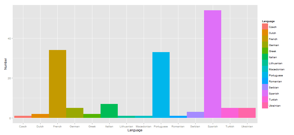
  •  Distribution of European Courses